01
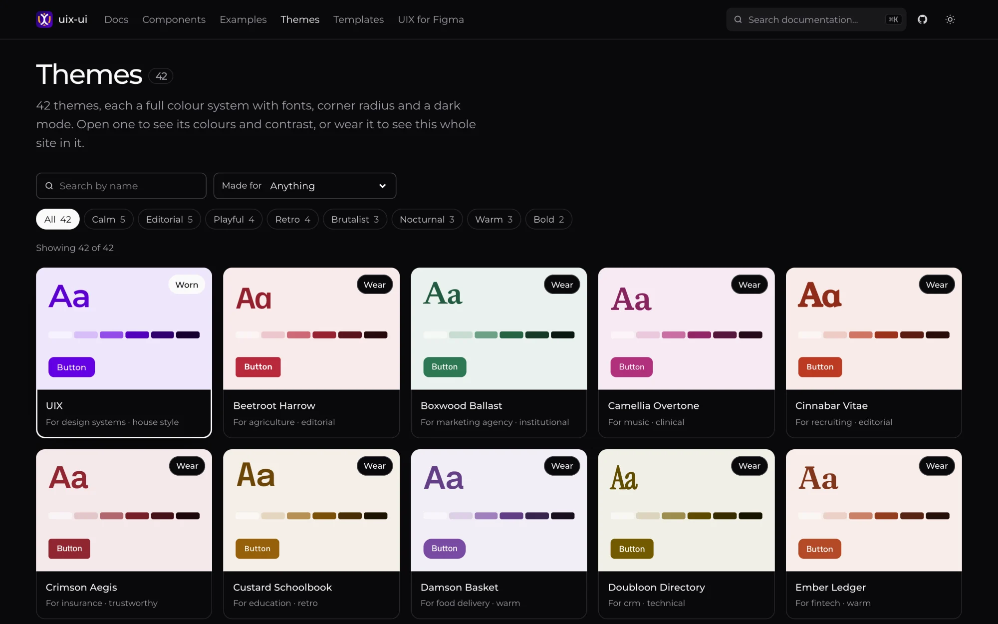
42 themes, one file each
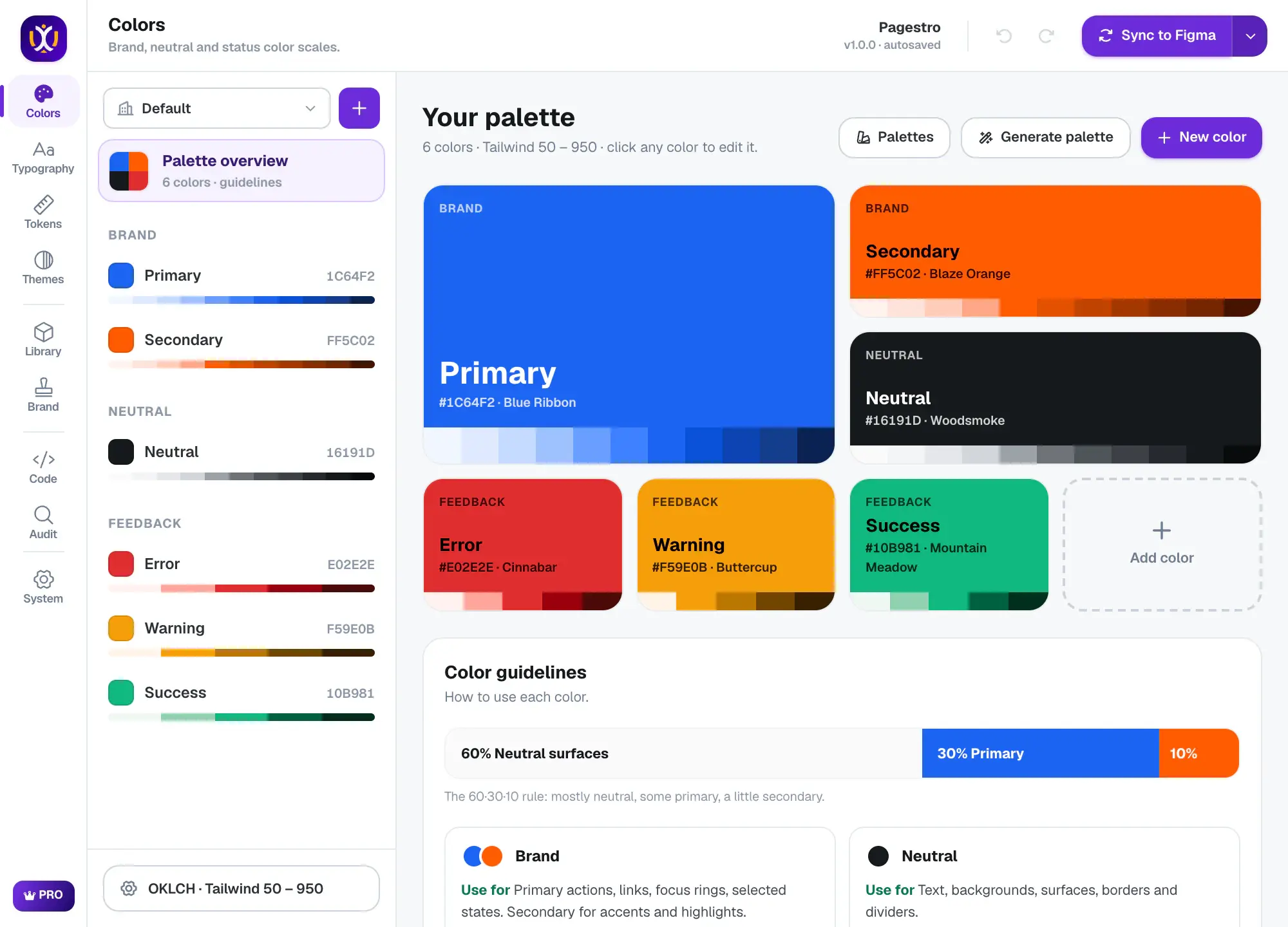
Each theme is a full color system with fonts, corner radius and a dark mode. Switch with npx uix-ui theme and the components stay as they are. Every text color passes WCAG AA in light and dark.
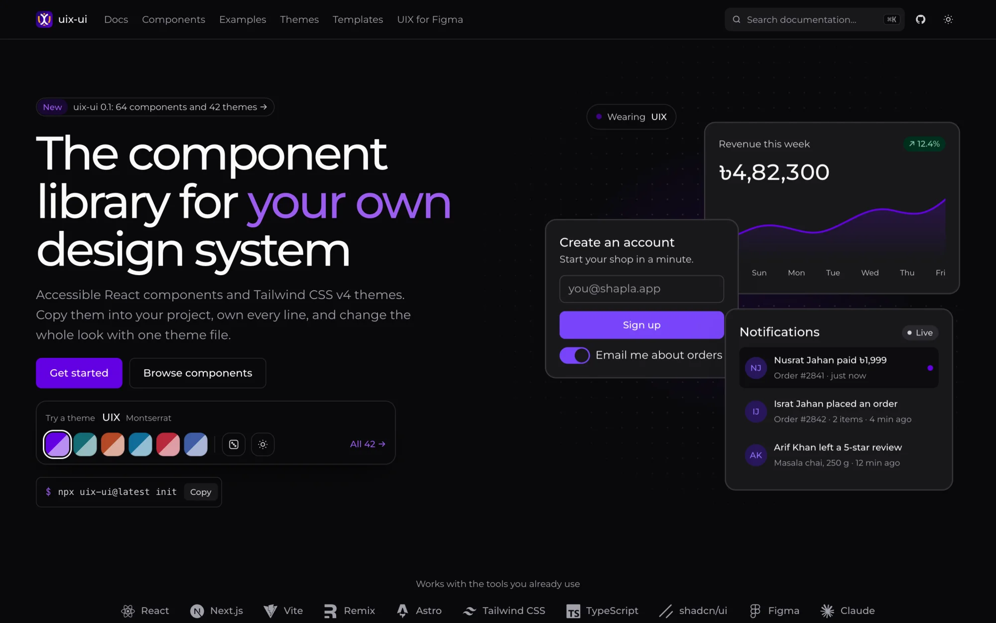
64 React components and 42 Tailwind CSS v4 themes. You copy them into your project and own the code.
uix-ui is an open-source React component library. Its CLI copies the components into your project, so you own every line and can change it, the way shadcn/ui works. Each of the 42 themes sets light and dark colors, fonts, radius and shadows in one CSS file.
The components and themes come out of the same engine as the UIX Figma plugin, so the code and the Figma library share names and tokens. Everything in the repository is MIT licensed. The icons inside the components are Lucide shapes under the ISC license.
Each theme is a full color system with fonts, corner radius and a dark mode. Switch with npx uix-ui theme and the components stay as they are. Every text color passes WCAG AA in light and dark.
Each component page has a live preview, the install command and usage examples. Button alone covers 7 variants, 3 sizes and 6 states.
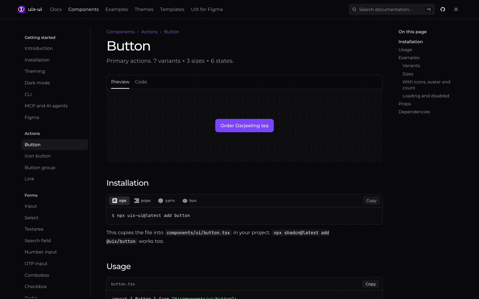
After init, components.json lists the @uix registry, so npx shadcn add @uix/button works too.
Point Claude Code, Cursor or VS Code at the UIX MCP server and your agent can search the themes and read their tokens.
The components carry the same names as the ones the UIX Figma plugin builds, so design files and code line up.
Run npx uix-ui@latest init in a React app with Tailwind CSS v4. It adds the theme file, the cn() helper and components.json.
npx uix-ui@latest add button card input copies them into src/components/ui.
npx uix-ui@latest theme switches to another theme. Your components do not change.
Yes. Every component and theme in the repository is MIT licensed, for personal and commercial work. UIX Pro is a separate paid add-on with marketing blocks, visual styles and more themes.
Yes. It works in any React 18 or 19 app with Tailwind CSS v4, including Vite, Next.js, Astro and Remix. The CLI stops if it finds Tailwind v3.
Yes. After init the shadcn CLI can add components from the @uix registry, and the registry URLs work without init as well.
No. uix-ui works on its own, and the plugin does not need it. They share component names and tokens, so they fit together if you use both.
uix-ui Free, MIT license
Browse componentsPDF tools, e-signatures, invoices, QR codes and an email builder in one browser workspace.
 Figma Plugin
Turns one brand color into Figma variables, styles, 74 components and code.
 Figma Plugin
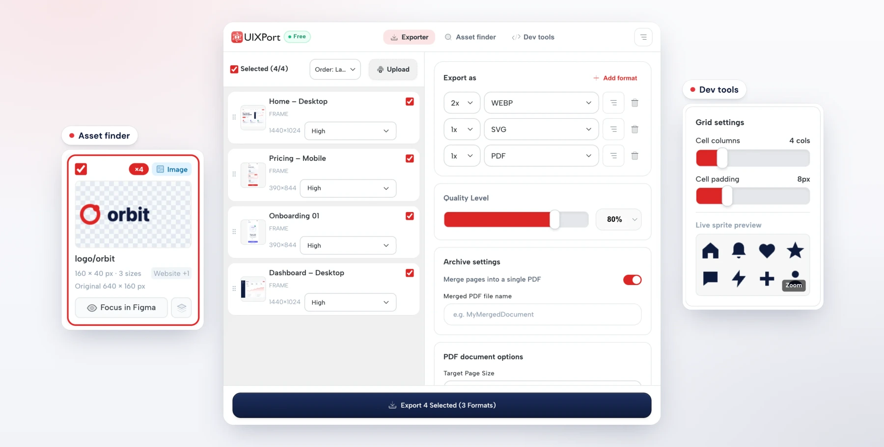
Exports PNG, JPG, WebP, AVIF, SVG and merged PDFs from Figma in one run.
 Icon Library
13,491 original icons in 15 styles on one 24 px grid. Three styles are free under MIT.